UX FELLOWSHIP PROJECT
LNKD
A team redesign of LinkedIn's mobile Home and Notifications experiences focused on reducing visual clutter, strengthening information hierarchy, and helping users prioritize what matters.
ROLE
UX Designer
TIMELINE
Sep. 2025 - Nov. 2025
TEAM
3 Designers
STATUS
Completed


TEAM + CONTRIBUTION
Collaborative research, with a heavier UI execution role.
My Contribution
Led/contributed to visual direction for redesigned cards and post interactions
Created high-fidelity Figma mockups and notification interaction components
Built and organized the clickable prototype
Analyzed mobile usability findings and iterated through critique
Team Process
Collaborated with two other designers across research and ideation
Shared critique and design decisions throughout the fellowship
Combined individual strengths into one consistent mobile concept
Scroll to read the full case study!
ORIGIN + PROBLEM
Why LinkedIn needed a rethink
LinkedIn is valuable for networking and career discovery, but its mobile experience can become visually dense.
Our team focused on the home feed and notifications: two areas where repeated content, competing visual elements, and weak grouping made relevant information harder to prioritize.
Instead of reinventing LinkedIn, we aimed to make it feel cleaner, more readable, and more intentional while preserving its recognizable identity.
How might we reduce clutter and improve prioritization without making LinkedIn feel unfamiliar?
The issue was not that LinkedIn lacked relevant information. The experience often made users work harder than necessary to identify what deserved attention, especially students and early-career users moving between posts, networking updates, and job-related notifications.
Reduce Feed Clutter
Give posts stronger boundaries and reveal secondary information only when needed.
Improve Hierarchy
Make career-relevant updates easier to distinguish and scan.
Preserve Identity
Modernize spacing and interactions without turning LinkedIn into a different product.

RESEARCH
Research pointed to an organization problem, not a relevance problem.
We combined survey feedback with a smaller think-aloud study to understand where the mobile experience felt difficult to scan and why some notifications were easy to miss.
41
survey responses helped us identify recurring friction around clutter, readability, navigation, and notifications.
2
undergraduate students completed think-aloud sessions focused specifically on the Notifications experience.
Relevant, but fragmented
Participants often cared about the content itself, yet the page made similar updates feel scattered.
Hard to prioritize
Job updates blended with other activity, making the most useful items harder to identify quickly.
Hierarchy mattered
The research suggested the strongest opportunity was better grouping and scanability rather than simply deleting information.

"Navigating the Jobs feature is the most difficult to navigate through as the premium pop-ups, filters, and various other features make the webpage overstimulating"
"Users felt overwhelmed by irrelevant content and wanted a more personalized, beginner-friendly experience — one that works for them, not recruiters."
OBJECTIVE
Three Goals that shaped every decision
01
Cleaner, modern layout
Strip away the noise and give content room to breathe with a clear visual hierarchy.
02
Easier navigation
Especially for job searches and notifications — make the most important actions impossible to miss.
03
A platform worth using
LinkedIn should feel like a tool users enjoy, not one they only open out of obligation.
DESIGN PROCESS
From audit to a more structured mobile system.
RESEARCH
User Research and Competitive Analysis
Surveyed 18–25-year-olds on LinkedIn pain points. Analyzed Slack, Discord, and Indeed to understand modern UX norms. Mapped user journeys through job searching, profile setup, and messaging to surface friction points.
DEFINE
Low-Fidelity Wireframes
Explored layouts that reduced cognitive load and created clear pathways to key actions. The core challenge was balancing simplicity with functionality — removing clutter without losing LinkedIn's professional identity.
DESIGN
Design System & Hi-Fi Wireframes
Established a modern color palette of blues and neutral tones — retaining LinkedIn's brand familiarity while softening contrast for clarity. Applied rounded UI elements for an approachable feel, with typography optimized for readability across mobile and desktop.
Prototype
Interactive Prototype in Figma
Built and linked key screens into a navigable prototype. Organized interaction flows for presentation and gathered critique-based iterations from the team before final delivery.
Lo-fi wireframes
Early sketches and grayscale wireframes focused on reducing clutter and cognitive load — establishing clear pathways to key actions before any visual styling was applied.


KEY DESIGN DECISIONS
Three changes shaped the final redesign.
DECISION 01
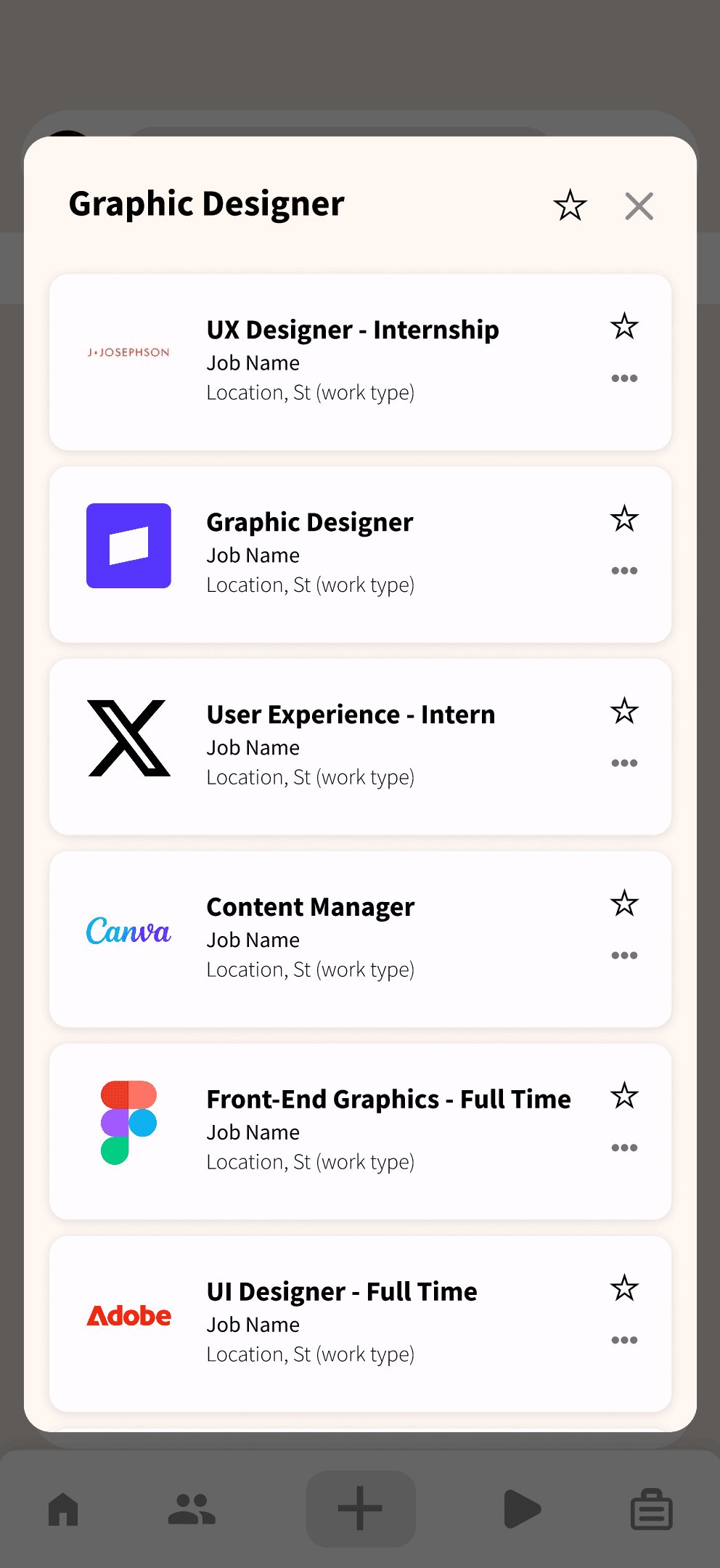
Grouping repetitive job updates into “job bubbles”
Think-aloud sessions showed that job-related notifications could be useful while still feeling repetitive and visually scattered. We grouped similar opportunities into compact bubbles so users could understand the category first, then choose whether to open the individual listings.
2 undergraduate students tested the notification experience in live think-aloud sessions, narrating their confusion as it happened.
Key finding: notifications were relevant but hard to scan — the problem wasn't content; it was information hierarchy and organization.
Job-related notifications blended into general platform activity — important updates were buried, not missing.
DECISION 02
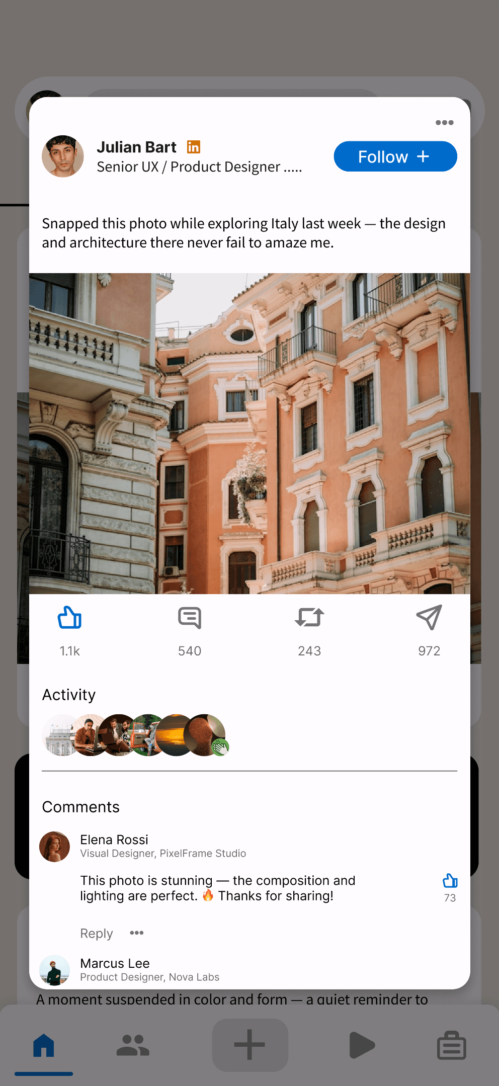
Turning the feed into clearer content cards
We strengthened card boundaries, spacing, and hierarchy so posts could be understood at a glance. Expandable overlay interactions kept the default feed lighter while still giving users access to the full post when they wanted it.
Clearer boundaries
Expandable content
Reduced visual load
DECISION 03
Modernizing without redesigning the brand
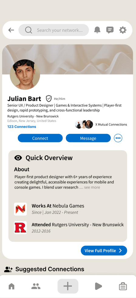
The goal was not to make LinkedIn look like a completely different social app. We used spacing, typography, grouping, and interaction changes to create a more minimal experience while preserving familiar navigation and recognizable visual cues.
DESIGN SYSTEM
Visual language decisions
Every visual decision traced back to research findings: clarity, personalization, and ease of use as the driving principles.
System Foundations
COLOR PALETTE
Blues + neutrals. LinkedIn brand familiarity with softened contrast.
TYPOGRAPHY
Source Sans Pro
Readability-first. Clean sans-serif pairing for the mobile layout.
UI ELEMENTS
Rounded corners throughout for a friendly, approachable feel. Clear visual hierarchy in every component.
FINAL EXPERIENCE
A cleaner LinkedIn, not a different LinkedIn.
The final concept reduces repeated visual weight across Home and Notifications while keeping the core behaviors familiar: browse, scan, open, and act.
DESIGN RESPONSE
Notification Grouping
I introduced job notification grouping — organizing related roles into categorized "bubbles" — so users could instantly distinguish job alerts from social activity without reading every line.
Reduced repetitive alerts
Improved scan-ability
Easier mental grouping



WHAT I LEARNED
Guidance doesn't have to mean giving answers.
This project helped me see that a redesign does not always need a dramatic new interface. The strongest research insight was that users could still value the content while struggling with how it was organized.
LEARNED
Simplicity and visual hierarchy are non-negotiable for professional platforms. Even small typography and layout changes meaningfully boost user confidence.
CHALLENGED BY
Maintaining core LinkedIn features, premium business plans, and organization/ layout of dense content in a visually appealing way while not overwhelming the users.
WOULD DO DIFFERENTLY
Run iterative usability testing earlier in the process, and explore accessibility features like contrast customization and font scaling from the start.
The redesign became less about making LinkedIn “look modern” and more about helping users understand what deserves their attention first.
VIEW OTHER WORKS
© 2026 Pranav Diddi