UX FELLOWSHIP PROJECT - 2026
Amazon
A fellowship team project focused on clearer product hierarchy, more personal shared-account orders, and more transparent recommendations.
ROLE
Primary UX Designer
TIMELINE
Feb. 2026 - Apr. 2026
TEAM
5 Designers
STATUS
Completed



TEAM + CONTRIBUTION
Primary ownership of the interface execution.
This was a collaborative project, but I took primary ownership of translating the research and design direction into the Figma interface. Because the team had varying levels of Figma experience, I handled much of the visual execution while keeping the design decisions collaborative.
My Contribution
Low- and high-fidelity interface design
Design-system components and visual consistency
Product-page hierarchy and interaction states
Prototype assembly and interface refinement
Team Process
Problem framing and research questions
Survey distribution and synthesis Amazon / competitor interface research
Presentation, feedback, and feature prioritization
Scroll to read the full case study!
ORIGIN + PROBLEM
We narrowed a broad redesign challenge into two moments of friction.
Our early brainstorm explored both NJ Transit and Amazon. The Amazon direction became the project we developed, centering on two issues: shared-account orders that blur who purchased what, and product pages where important decision information competes for attention.
Early exploration
NJ Transit · previous departures + a less cluttered mobile UI
Selected direction
Amazon · product information hierarchy + shared-account order clarity
Information overload at the moment of decision.
Our early brainstorm explored both NJ Transit and Amazon. The Amazon direction became the project we developed, centering on two issues: shared-account orders that blur who purchased what, and product pages where important decision information competes for attention.
RESEARCH
80 responses showed a familiar product that still asks users to work for clarity.
Because the fellowship timeline was short, our primary user research was a pre-design survey collected over several days. The sample leaned heavily toward college-age participants, so we treated the findings as directional rather than universal.
46.3%
reported having experienced confusion or frustration while using Amazon.
48.7%
said product information is complete, but requires effort to find. Another 15% described it as overwhelming.
85%
rated a clearer visual hierarchy as at least moderately helpful (moderately + very + extremely helpful).
Shared accounts mattered too: among 65 responses to the follow-up question, 41.5% said they often saw orders that were not theirs.
Research Persona

DESIGN DIRECTION
Improve the hierarchy, not the user's mental model.
Our secondary research reinforced an important constraint: Amazon's interface is dense for reasons tied to behavior, conversion, and familiarity. So the redesign stayed evolutionary. We kept familiar product cards, rating patterns, horizontal carousels, and purchase actions while changing what gets visual priority.
Guide without prescribing
Make the redesign feel like Amazon, not a new shopping app.
Surface patterns, not diagnoses
Show the decision-critical details first; move secondary detail one tap deeper.
Keep AI in the background
Recommendations should show why they are present, especially when sponsored.
The goal became less “clean Amazon up” and more “give every layer of information a clearer job.”
LOW-FIDELITY WIREFRAMES
Testing structure before visual polish.
The lo-fi stage explored product-title structure, a collapsed/expanded price card, order filtering, and a profile switcher for shared accounts. This let us agree on hierarchy and interaction before investing in the final UI.


Digital Lo-Fi Wireframes
KEY DESIGN DECISIONS
Four targeted changes carried most of the redesign.
DECISION 01
Restructure the product title
Instead of letting one long keyword-heavy sentence dominate the top of the page, the redesign separates a shorter display title from scannable feature chips and supporting details.

DECISION 02
Turn the price-zone into progressive disclosure
The price card surfaces the final price, savings, coupon, stock, and key delivery options first. Payment, seller, returns, and shipping detail remain available through an expandable layer instead of competing at the same visual level.

DECISION 03
Separate shared-account shopping context
A “Who's shopping?” profile switcher gives households a clearer way to separate personal order history, recommendations, and browsing context. The orders view also adds search, filtering, and stronger grouping for upcoming deliveries.

DECISION 04
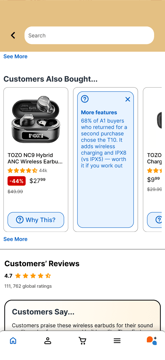
Explain recommendations instead of only showing them
A small “Why this?” chip can reveal the relationship behind a recommendation. Sponsored placements are labeled as paid rather than presented as behavioral suggestions, supporting more transparent trust.

VISUAL SYSTEM
Building consistency before scaling the hi-fi screens.
I built reusable visual pieces around Amazon's recognizable navy, orange, yellow, and blue while standardizing price cards, badges, recommendation cards, review blocks, and navigation elements.
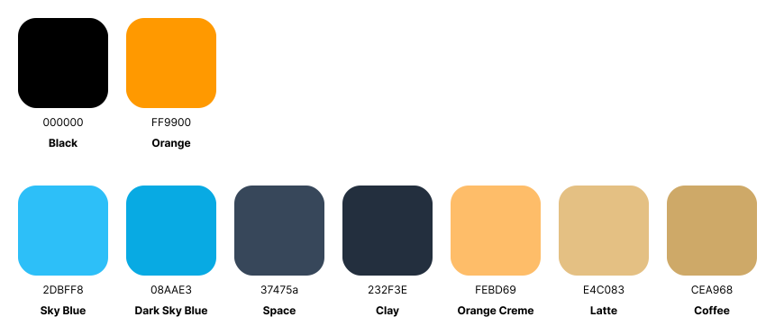
The system was intentionally compact: enough structure to keep the redesign coherent within the fellowship timeline, without overbuilding a full production library.
FINAL EXPERIENCE
More clarity, without losing Amazon.
The final screens keep the core shopping flow recognizable while making decision-critical information easier to parse and secondary information easier to access when needed.


OUTCOME + LIMITATIONS
A complete concept with validation still left to do.
Within the fellowship window, we completed the survey, secondary research, persona, lo-fi structure, design system, hi-fi screens, and prototype direction. The main limitation was time: we did not run a post-design usability study, so the redesign should be treated as a research-informed concept rather than a validated improvement.
Future direction (if applicable)
Test product scanning
Compare how quickly users can locate price, delivery, highlights, and reviews.
Validate profile mental models
Test whether shoppers understand the difference between an Amazon account and a shopping profile.
Measure recommendation trust
See whether “Why this?” improves understanding without adding distracting UI.
WHAT I LEARNED
Redesigning a mature product is often an exercise in restraint.
The most useful lesson was that a cleaner interface is not automatically a better one. Amazon's density supports real shopping behavior and business goals, so our strongest ideas were the ones that reorganized complexity rather than pretending it could disappear.
For me, the project also strengthened a different skill: taking a research direction and carrying it through a full interface system while working inside a team with mixed design experience.
VIEW OTHER WORKS
© 2026 Pranav Diddi